Stationary
Corporate branding on stationary
-
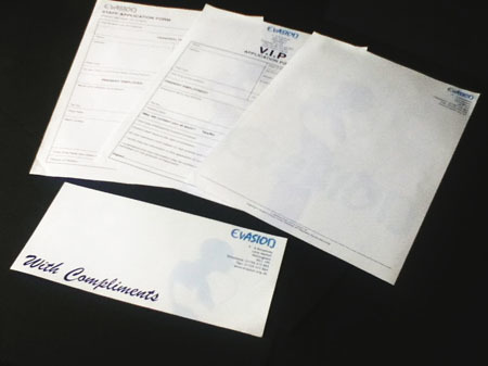
![A newly established nightclub requested a range of business material that reflected the sophisticated atmosphere of the club. Letterheads compliment slips, V.I.P and club membership forms were designed to compliment the logo and stylish ethos of the club.]()
Evasion
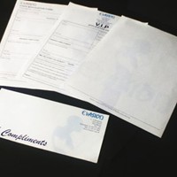
A newly established nightclub requested a range of business material that reflected the sophisticated atmosphere of the club. Letterheads compliment slips, V.I.P and club membership forms were designed to compliment the logo and stylish ethos of the club.
-
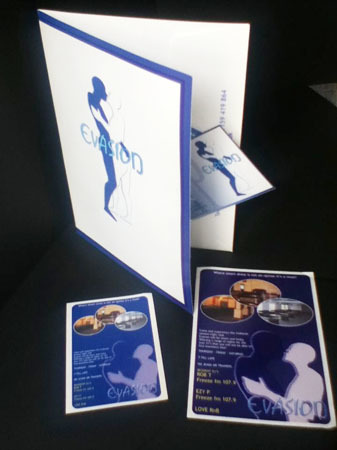
![Evasion wanted a logo that reflected the concept of a man and woman intertwined as one. The logo needed to be eye catching and instantly recognised. It was used on all marketing and promotional material.]()
Booklet and marketing material
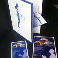
Evasion wanted a logo that reflected the concept of a man and woman intertwined as one. The logo needed to be eye catching and instantly recognised. It was used on all marketing and promotional material.
-
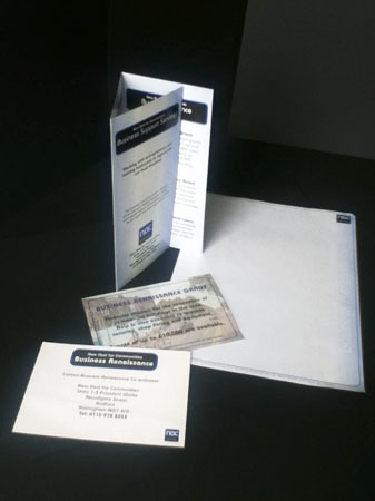
![NDC was a £50,000,000 community regeneration project that that took place over 10 years. Marketing material including leaflet and postcards can be seen with the letterhead. The design brief was to create a simple logo that created a formal and uniformed image.]()
New Deal for Communities
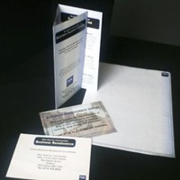
NDC was a £50,000,000 community regeneration project that that took place over 10 years. Marketing material including leaflet and postcards can be seen with the letterhead. The design brief was to create a simple logo that created a formal and uniformed image.
-
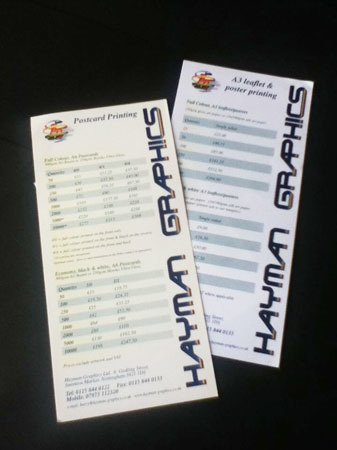
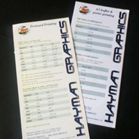
![The brief was to design a series of customer reference cards. Using the logo as the focal point to the right allowed for any text on the left to be read into the logo.]()
Hayman Print and Graphics
The brief was to design a series of customer reference cards. Using the logo as the focal point to the right allowed for any text on the left to be read into the logo.
-
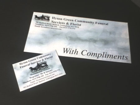
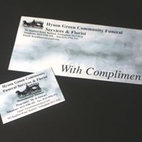
![After designing several booklets for various funerals, a request was made by the Funeral Director to design a compliment slip and card. The concept was to use a image of an old horse and cart combined with the traditional marble effect and theme to produce a simple, tasteful design.]()
Funeral Directors
After designing several booklets for various funerals, a request was made by the Funeral Director to design a compliment slip and card. The concept was to use a image of an old horse and cart combined with the traditional marble effect and theme to produce a simple, tasteful design.
-
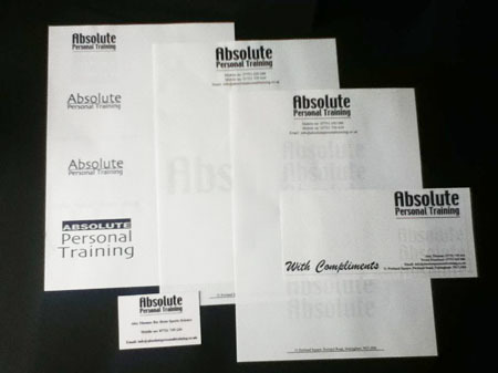
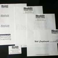
![Requested by Personal Fitness Trainer to design a range of stationary with a clean, crisp logo. The word 'Absolute' was to stand out as the focus of the branding.]()
Absolute Fitness
Requested by Personal Fitness Trainer to design a range of stationary with a clean, crisp logo. The word 'Absolute' was to stand out as the focus of the branding.
-
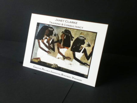
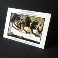
![Using a images taken from Egyptian tombs. The idea was to envisage a business that was feminine whilst being powerful.]()
Janet Clarke Consultancy
Using a images taken from Egyptian tombs. The idea was to envisage a business that was feminine whilst being powerful.
-
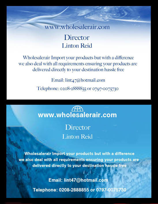
![An online whole sale company wanted a relaxed feel to their marketing material. The concept being that those receiving the card would feel relaxed browsing, which in turn would lead to them purchasing.]()
www.wholesaleair.com
An online whole sale company wanted a relaxed feel to their marketing material. The concept being that those receiving the card would feel relaxed browsing, which in turn would lead to them purchasing.
-
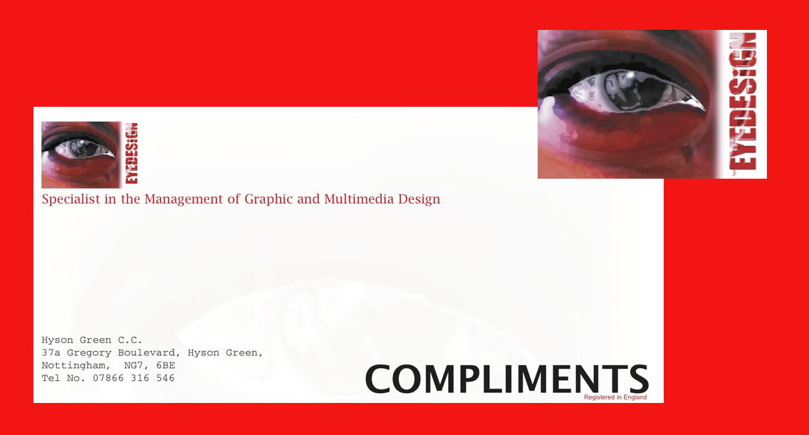
![A graphic design company with an eye for design. Why Eyedesign? Well, you see what I design.]()
Eyedesign
A graphic design company with an eye for design. Why Eyedesign? Well, you see what I design.